
Power BI is Microsoft’s interactive “business intelligence” data visualization software product. We spoke to Victoria Lucas, head of English and mathematics at Bishop Burton College about how they are integrating CENTURY data across their vocational courses.
Since we implemented CENTURY, our English and mathematics lecturers have been consistently using the data available on the platform to inform their teaching. That’s been very useful for them, but as a Further Education college we need more than just successful English and mathematics departments - we need to embed the core subjects throughout the whole college. We know that when students are confident with English and mathematics, it reflects positively in their progress in their vocational course as well.
To achieve that, we needed to find a way to succinctly integrate English and mathematics skills into all subjects. We recently started to use Power BI to ensure that the lecturers in vocational subjects have access to all of the data they need to do this effectively.
Power BI stitches together the vocational subjects with the English and mathematics data from CENTURY, meaning that subject lecturers don’t have to spend time collating all of that information manually. This is particularly useful for us given that our vocational lecturers don’t use the platform themselves.
Using Power BI, lecturers can see how many students are studying a particular course, for example Animal Management Level 1, how they’re getting on with their course both as a cohort and individually, and how they’re progressing with English and mathematics on the platform.
This has been absolutely fantastic for us so far in terms of bridging the gaps between the core subjects and the vocational areas, and I think other colleges would definitely benefit from using Power BI to do the same.
So, how does Power BI actually work? We spoke with Stephen Shepherd, IT Project and Integration Analyst to find out.
Step 1: Preparing the data
To start with, I pulled together all of the data that is important to us for this report from various sources. This will vary from institution to institution depending on what data is captured and where it is stored, but for us at Bishop Burton, we wanted to include data from our timetabling system, our MIS and from CENTURY.
Once I had imported all of the data from these sources to Power Query Editor, which is where you initially import and transform (clean) data before producing visuals, I started to stitch it together.
To do this, I created a master dataset. In simple terms, this involved merging the CENTURY scores with our MIS and Attendance data, connected by student reference number, as this is a unique value. This unlocked the door to our MIS, allowing me to access any of the fields from there that we wanted to be able to filter by, for example age range, curriculum area, whether students are full or part time and so on.
You have to be quite careful at this stage with merging the data to ensure that you don't end up with duplicate records and so on, but this shouldn’t be a problem for anyone who regularly works with data. There’s also quite a bit you can do to clean the data up. For example, our MIS data goes back four years, but we don’t need all of that, so I stripped that out to just show this year’s data set.
Step 2: Using Power BI Desktop
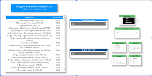
Once I’d set this up, I moved over to Power BI Desktop. Here I could see all of the data sets I’d built and choose how to visualize each piece of information. For example as a bar chart, pie chart or geomap. Similarly to Excel, there are tabs along the bottom so I could split up all of the visuals into related groupings, for example ‘nugget data’ or ‘average score’.
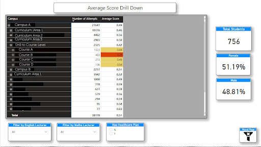
This Average Score screenshot below shows a drilldown page allowing staff to get all the way down the student level and individual nugget level scores.
The Scores are then colour RAG rated so that staff can identify strengths and weaknesses. Equally, as a Manager or SLG, you can drill at a much higher level and see how Courses, Curriculum areas and even Sites are doing. Additionally, filters have been added to allow mathematics and English lecturers to be split out.