Promoting a healthy data-driven culture
Estimated reading time: 4 minutes
What are good data practices? What should be avoided? Liz Macfie, Data Scientist at CENTURY, gives us some insight.
Over my years in data science (and also those as a mechanical engineer before that) I’ve had to learn good data practices, often through making mistakes. I’m going to share some of the more easily avoided slip-ups I’ve seen/ done with the hope that this might especially help organisations without a dedicated “data” team (or at least without someone as outspoken as me!).
Track everything. Immediately.
Resources can be spread thinly when starting a new project, especially if there are tricky deadlines to meet. Regardless, data gathering has to be an immediate priority, even if nothing is done with it straight away. We can guarantee that in 3 months time some bright spark will ask how current user behaviour compares to past user behaviour.
I’d also recommend having a kick-off meeting with all personnel who might eventually want to use the data. Perhaps developers don’t know the whole story and would have left out the tracking of a metric that later became a key business priority.
Avoid vanity metrics
It’s understandable, especially when just starting a new project, to be fascinated with raw user numbers. We want to track every action they take, we want to know how many there are, we want to see live activity. This is perfectly fine and can create a shared excitement as screens go up showing what users are doing in real time. However, we have to go deeper than these metrics for business decisions.
A very simplistic example: Let’s say the most important part of our product is a button, and every time a user presses it, we magically get some money. Obviously we want to measure engagement with this button, so we create a graph showing the number of button presses each day.

We spot that the button press numbers go down at the weekend and start fretting over what this could mean: do users only want to pay on weekdays? Someone then thinks to plot number of daily button presses per number of daily users and gets this:

It turns out there is no problem with button engagement, there are just fewer users at the weekend. Reporting the “vanity metric” (number of button presses) rather than the actionable metric (number of button presses per user) was unhelpful.
Keep numbers accurate
We’ve all been there. The quarterly report is due, and we’re the tiniest of fractions below a particular target. Knowing that there are three kinds of lies (lies, damned lies and statistics) we work out a way to “massage” the data so that it falls on the correct side of this arbitrary line. Ethics aside, there are a couple of major problems with this:
- Anyone else wanting to produce the same numbers has to know about our statistical manipulations otherwise there will always be discrepancies, and trust me — if there’s one thing any board hates, it’s discrepancies.
- If we actually improve the next quarter, but still don’t hit that target, what do we report? The accurate apparently lower number, or do we engage in more data trickery to also bring this second number above the target, so correctly reporting an improvement?
I say, the more honest you are with data in all reports, the more grateful you will be in the future.
Verify all results
I don’t think I’ve ever regretted taking a little longer to check numbers I’m about to report, but I’ve certainly often regretted moving too fast and reporting an inaccuracy. This can so frequently be avoided by having multiple ways to generate the same statistics: perhaps we send website data to two sources; perhaps we store the same information in databases in two slightly different ways; perhaps we carry out a calculation again with the steps in a different order.
In addition to this, there should always be an idea of whether variations being reported are “significant”, but that’s a topic for another post.
And finally… my personal pet peeve…
Throw out the pie charts
Just no. Can we please stop with these now? They are a tool to teach students about circle sectors or to show the proportion of uneaten pizza… they are not a valid data visualisation!

All of these are very basic non-technical ways to start a healthy data-driven culture within any company. After setting these principles, the fun begins!
CENTURY in the news
View all News
-
Blog
10th July 2025
The Science Behind CENTURY
In this blog post, Tom Thacker, Chief Education Officer at CENTURY, refers to Prof. Dr. Carl Hendrick's recently published guide into the science behind learning. Tom summarises the science behind learning and explains how and where this has been applied…
Read more
-
Blog
10th July 2025
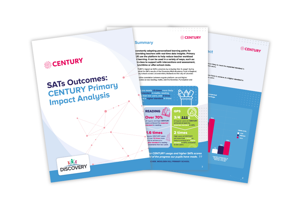
CENTURY Tech report reveals significant positive impact of AI-powered learning on…
CENTURY Tech, the award-winning AI-powered teaching and learning platform, today announced the publication of its latest impact analysis report, demonstrating a strong positive correlation between regular use of the CENTURY platform and higher Key Stage 2 SATs results.
Read more